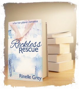
 Last week, I hit publish on the print version of Reckless Rescue. Even though the ebook has been out since February, it’s taken me this long to actually get a matching print book. Some of this was due to the fact that each time I ordered a proof copy, it took 2-3 weeks to get to me in Australia, but a lot was due to simply being intimidated by the idea of formatting my own book.
When I actually sat down and did it though, it wasn’t half as scary as I thought it would be! So today I thought I’d share some tips that I found useful when formatting and uploading my book.
1 – Use Garamond – Fonts in print books are different to online, and some work better than others. There are several fonts that work, in fact, Joel Friedlander lists the 5 most popular, but if in doubt, Garamond is a safe bet!
2 – Watch your caps/smallcaps – If you want to start your chapter with smallcaps, you’ll want a pro version of your font, otherwise the upright strokes of the letters will look feint and may not print properly. I used Adobe Garamond Pro.
3 – Proof online first – Createspace’s online previewer is great (if slow to load), and make sure you check it there first before ordering a proof copy. Anything you can fix before you order a physical copy is worth it! If you only have typos etc to change after your first physical proof, you probably don’t have to order a second proof.
4 – Use Word – I didn’t want to, I even tried setting up my novel in Adobe InDesign, which is the professional tool for the job. Took me at least a month of avoiding it before I decided it wasn’t worth it. I downloaded one of the Createspace templates, and copied and pasted, then made a few formatting changes etc.
5 – Use High Resolution Graphics – If you’re using pictures, even just an author picture or cover of your next book at the end, use the biggest sizes you have. Your final uploaded file can be up to 50mb, so unlike an ebook, you don’t have to keep it small! High res graphics will not only look good, but they’ll prevent you having your file rejected for low res ones!
6 – Save as PDF/A-1a:2005 – I tried uploading the word file at first, thinking createspace would change it, then had a lot of trouble with a rejection for not having big enough gutters. Turns out my blank page was being removed, and so all the mirrored gutters were on the wrong side!
Hopefully, now that I have one experience with print formatting under my belt, it won’t take as long for me to format Reckless Rebellion and get it uploaded!
Have you done any formatting for print? Any tips to share?

Hehe I did mine totally differently! I’ve heard so many different stories and things though, that I think CreateSpace must be a bit random. I’ve heard people have problems with page numbers and things when uploading a PDF so I stuck with Word. Of course, I’m still waiting for my final version, so I’ll probably have something completely different to say then. I think mine is in Times New Roman and I uploaded mine as a word file using mirror gutters – my blank pages looked okay but now you’ve got me worried! It is so much more nervewracking though because it’s so permanent. I’m actually hoping no one buys a copy! I know that’s silly, but I make less money per copy but their expectations will be higher because they’ve spent so much.
Good luck with yours, with your attention to detail I’m sure it will be fabulous! 🙂
Yes, I’m sure there are a lot of different experiences! I probably would have had an easier time if I hadn’t used images for the headers, meaning I had quite a few of them! I just couldn’t get a word file to pass their inspection process because of it.
I agree with you on the nervewracking! With an ebook, if I find a mistake I can just fix it, but a print book is different! It’s already out there. Of course, even traditionally published books come out with typos, so I try not to get too stressed out about it.
Thanks for the information.
No worries. I hope some of it is useful! Are you planning on making a print copy of your novel?